Partnership & media
Brand guidelines & logos
Everything you need to write about or partner with Brandaris — marks, colours and usage rules. Free to use in press coverage and partner material; please don't imply endorsement we haven't given.
Download the full pack (.zip)The name
Brandaris (pronounced bran-DAH-ris) is the oldest lighthouse in the Netherlands, standing on Terschelling since 1594. The name carries the product's core metaphor: listening is the sweep — the beam that watches the whole category — and review is the guiding light. Nothing ships without a human yes.
Marks
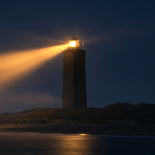
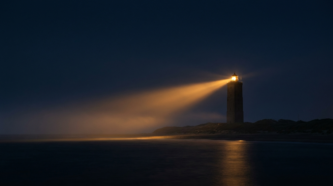
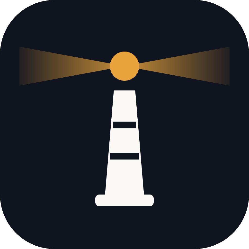
Lighthouse mark — photographic
The primary product mark — nav, app and emails. Crops to a rounded square.
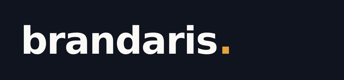

Monogram
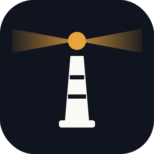
Flat lighthouse monogram — favicons and sizes where a photograph won't read.


Colour
Night
#10141F
Primary dark ground
Sea
#23324D
Secondary dark
Beacon
#E8A33D
The accent — dots, links, beams
Beacon deep
#B06D10
Beacon on light grounds
Paper
#FAF9F6
Light ground, text on dark
Mist
#7B849C
Muted text, captions
Usage rules
- The photographic lighthouse mark is the product identity — nav, app and email. Use the flat monogram only where a photograph won't read: favicons and very small sizes.
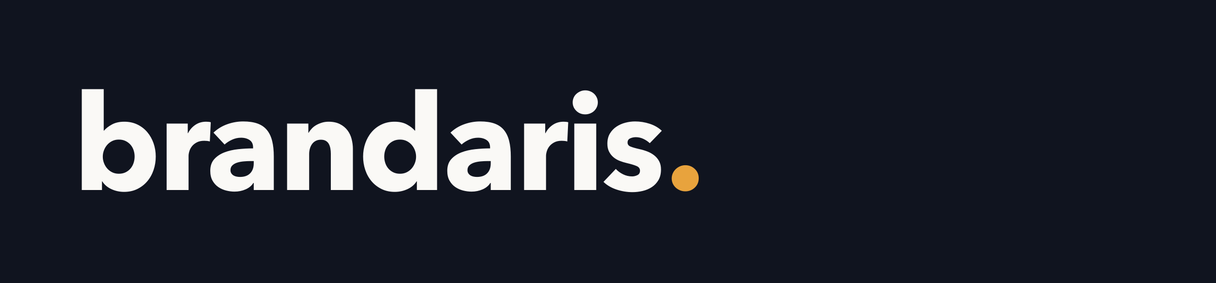
- The full stop in the wordmark is the beacon. Never set the wordmark without it, and never colour it anything but beacon amber.
- One light source: beacon amber is the only saturated colour on the page — everything else is night, sea, paper and mist.
- In running copy write Brandaris (title case, no dot); the lowercase dotted form is the wordmark only.
- Don't recolour, stretch, outline or add effects to the marks. Use the supplied files.
- Give the marks clear space of at least the height of the letter b on every side.
The full written guide is included in the pack, or download it separately.
Talk to us
Press and partnership enquiries go straight to the founders. We answer quickly and plainly.
Email hello@brandaris.studio